You've spent time and money driving traffic to your website, but for some reason, those visitors aren't turning into customers. It's a frustrating but common problem for many business owners and marketers. Your website is your digital storefront, and if it's not optimized for conversions, you're leaving money on the table.
Even small issues can have a big impact on your bottom line. From slow loading times to confusing navigation, these common website mistakes can send potential customers running to your competitors. Understanding these pitfalls is the first step toward creating a better user experience that encourages visitors to take action.
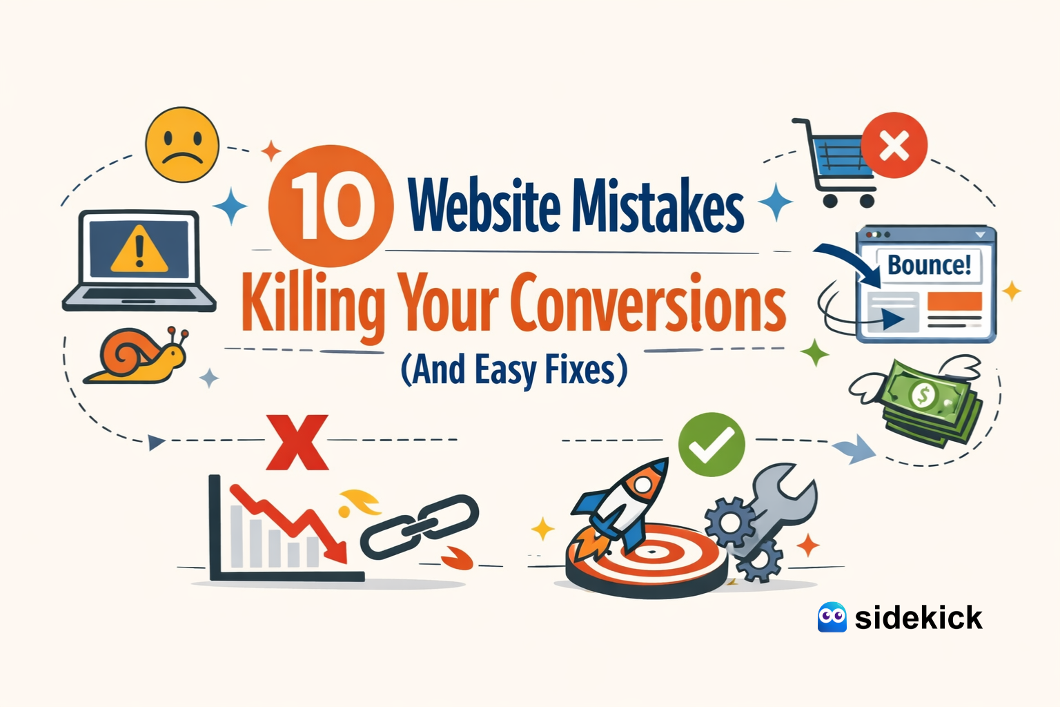
This guide will walk you through the ten most common website mistakes that kill conversions. More importantly, we'll provide simple, actionable fixes for each one. By implementing these strategies, you can transform your website into a powerful tool for generating leads and sales, helping you achieve your business goals.
Mistake 1: Poor Mobile Optimization
More than half of all web traffic now comes from mobile devices. If your website isn't easy to view and use on a smartphone, you're alienating a huge portion of your audience. Users expect a seamless experience, and they won't waste time pinching and zooming to read your content or find a button. A clunky mobile site leads to high bounce rates and lost conversions.
The Fix: Implement Responsive Design
A responsive design automatically adjusts your website's layout to fit any screen size, from a desktop monitor to a smartphone. This ensures every visitor has a positive experience, regardless of the device they're using. Most modern website themes and platforms, like those we build at SideKick, are responsive by default. If your site isn't, it's time for an upgrade. Test your site's mobile-friendliness using Google's free tool and prioritize making it accessible for everyone.
Mistake 2: Slow Loading Speed
Patience is not a virtue online. If your website takes more than a few seconds to load, visitors will leave before your content even appears. Slow loading speeds frustrate users and directly impact your conversion rates. Every second of delay increases your bounce rate and reduces the chances of a visitor making a purchase or filling out a form.
The Fix: Optimize for Speed
Improving your site's speed involves a few key actions:
- Optimize Images: Large image files are a primary cause of slow load times. Compress your images before uploading them to your site without sacrificing too much quality.
- Leverage Browser Caching: Caching stores parts of your website on a visitor's browser, so it doesn't have to reload everything on subsequent visits. This makes loading much faster for repeat visitors.
- Use a Content Delivery Network (CDN): A CDN stores a copy of your website on servers around the world. It delivers content from the server closest to the user, which dramatically reduces loading times for a global audience.
Mistake 3: Unclear Calls to Action (CTAs)
Your Call to Action is arguably the most important element on your page. It tells visitors what you want them to do next. If your CTAs are vague, hidden, or non-existent, your visitors will be left wondering what to do. Phrases like "Click Here" or "Submit" are not compelling. They don't communicate value and can easily be overlooked.
The Fix: Use Clear, Action-Oriented Language
Your CTAs should be impossible to miss and easy to understand. Use strong, action-oriented words that create a sense of urgency and clarity.
- Instead of "Submit," try "Get Your Free Quote" or "Download My Guide."
- Make your CTA buttons stand out with contrasting colors.
- Place them prominently where users are likely to look, such as after a compelling piece of information or at the end of a section.
Mistake 4: Complicated Navigation
If visitors can't find what they're looking for quickly, they'll get frustrated and leave. A complicated navigation menu with too many options, confusing labels, or a disorganized structure creates a poor user experience. Your website should feel intuitive, guiding users effortlessly to the information they need.
The Fix: Simplify Your Site Structure
A clean, simple navigation is key to a good user experience.
- Simplify Menus: Limit your main navigation menu to essential pages (e.g., Home, About, Services, Blog, Contact). Use dropdowns for sub-pages if necessary, but keep them organized.
- Improve Site Search: A prominent and effective search bar can be a lifesaver for users looking for something specific.
- Use Breadcrumbs: Breadcrumb navigation shows users their current location on your site (e.g., Home > Blog > 10 Website Mistakes). This helps them understand the site structure and easily navigate back to previous pages.
Mistake 5: Ignoring SEO Basics
You can have the most beautiful, user-friendly website in the world, but if no one can find it, it won't generate any conversions. Search Engine Optimization (SEO) is the practice of optimizing your site to rank higher in search engine results. Ignoring basic SEO means you're missing out on valuable organic traffic from potential customers actively searching for your products or services.
The Fix: Optimize Your On-Page SEO
Basic on-page SEO is something any website owner can implement.
- Optimize Title Tags and Meta Descriptions: These are the first things users see in search results. Write compelling titles and descriptions that include your target keywords and encourage clicks.
- Use Relevant Keywords: Research what terms your audience uses to find solutions like yours. Incorporate these keywords naturally throughout your website content, including in headings and body text.
- Create Quality Content: Regularly publishing helpful, informative content (like blog posts) attracts visitors and signals to search engines that your site is a valuable resource.
Mistake 6: Lack of Social Proof
People trust people. If your website doesn't show any evidence that other people have had a positive experience with your business, visitors might be hesitant to trust you. Without testimonials, reviews, or case studies, you're missing a powerful opportunity to build credibility and convince potential customers that you're the right choice.
The Fix: Display Testimonials and Reviews
Social proof is a powerful conversion tool. Actively collect and display feedback from your happy customers.
- Place testimonials and positive reviews prominently on your homepage and product/service pages.
- Use photos and names (with permission) to make them more authentic.
- Showcase logos of well-known clients you've worked with.
Mistake 7: Cluttered Design
A website with too much text, too many images, and competing elements creates sensory overload. Visitors don't know where to look or what to click. This visual chaos can be overwhelming and will cause many users to abandon your site in search of a simpler, more pleasant experience.
The Fix: Embrace Whitespace and Clean Design
Whitespace (or negative space) is the empty area around elements on a page. It's not wasted space—it's a crucial design tool.
- Use whitespace to break up text and guide the reader's eye.
- Focus on a clean, uncluttered layout that highlights your most important content and CTAs.
- Stick to a consistent and limited color palette and font selection to create a professional and cohesive look.
Mistake 8: No Clear Value Proposition
When someone lands on your homepage, they should immediately understand who you are, what you do, and why they should care. If your value proposition is buried or unclear, visitors won't stick around to figure it out. They'll simply bounce and find a competitor who communicates their benefits more effectively.
The Fix: Craft a Compelling Headline
Your homepage headline is prime real estate. Use it to state your unique value proposition clearly and concisely. For example, our headline SideKick is "Professional Website, On a Subscription." It immediately tells visitors what we offer and what makes us different. Your headline should answer the visitor's question: "What's in it for me?"
Mistake 9: Annoying Pop-Ups
We've all been there: you land on a site, and before you can even read the first sentence, a massive pop-up blocks your view, demanding your email address. While well-timed pop-ups can be effective, overly aggressive or immediate ones are intrusive and annoying. They interrupt the user experience and can drive visitors away before you've had a chance to provide any value.
The Fix: Use Exit-Intent Pop-Ups
Instead of bombarding visitors the moment they arrive, use exit-intent pop-ups. These appear only when a user's cursor moves toward the "close" or "back" button, indicating they're about to leave. This is your last chance to capture their attention with a compelling offer, like a discount or a free resource, without having annoyed them at the start.
Mistake 10: A Complicated Checkout or Contact Process
You've done everything right—the visitor wants to buy your product or contact you. But then they're faced with a long, complicated form that asks for unnecessary information. Every extra field is another chance for them to abandon the process. High friction at the final step is a guaranteed way to kill conversions.
The Fix: Streamline Your Forms
Make it as easy as possible for customers to give you their money or their information.
- Only ask for the absolute essentials. Do you really need their phone number for a newsletter signup?
- For checkout processes, offer guest checkout options and use progress bars to show users how close they are to completion.
- Keep forms short and simple. The less work a user has to do, the more likely they are to convert.
Build a Website That Converts
Fixing these common website mistakes can have a significant impact on your conversion rates. By focusing on a clean design, clear messaging, and a seamless user experience, you can turn more of your visitors into loyal customers. It's about putting your audience first and removing any barriers that stand in their way.
If you're feeling overwhelmed by the technical details, don't worry. A professional partner can handle the web-wizardry for you. At SideKick, we design, build, and maintain websites that are optimized for conversions from day one, all for a simple monthly subscription. This lets you focus on running your business while we ensure your online presence is always working for you.


